Universal Colours
Project overview
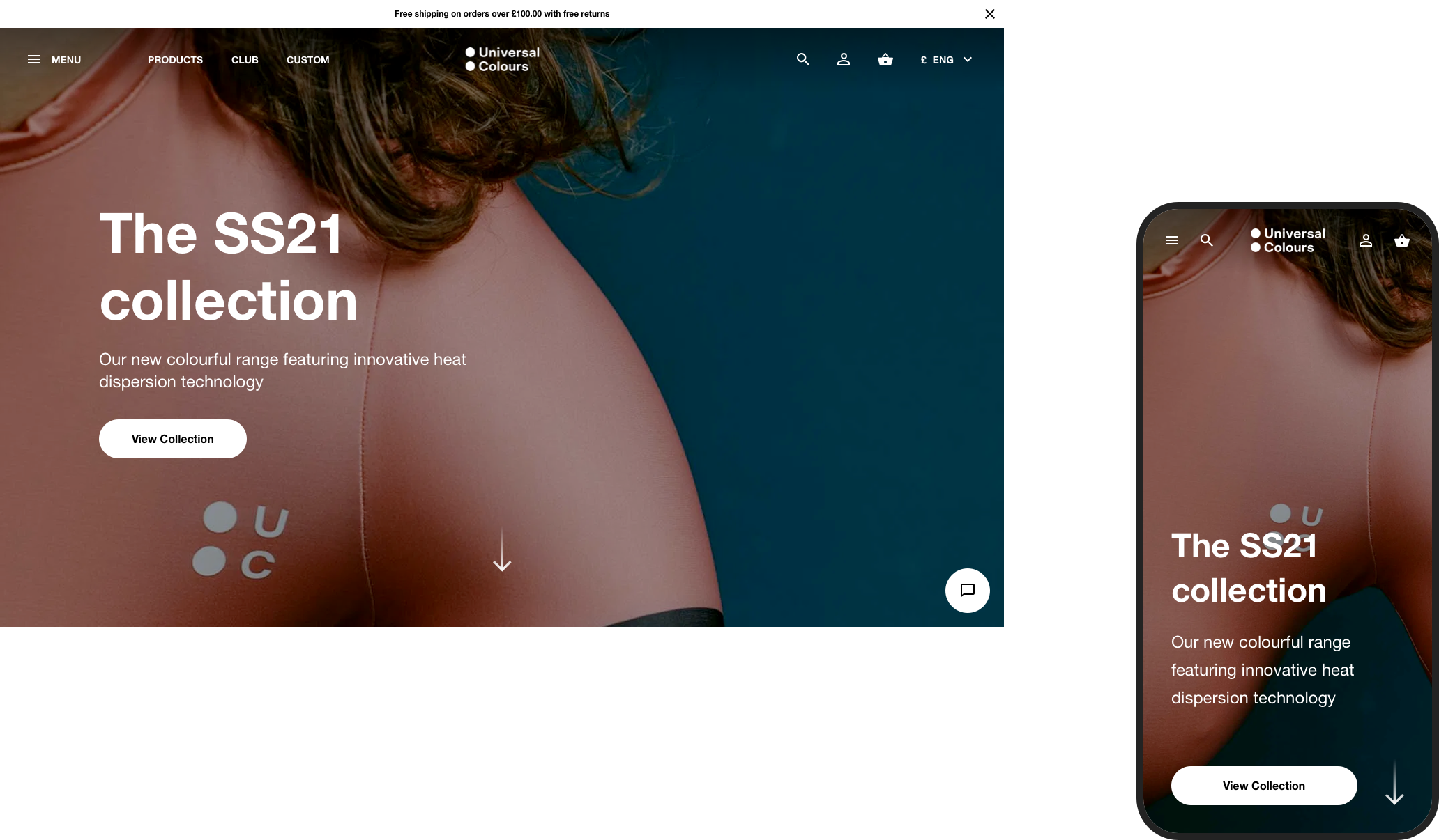
It's probably obvious that I love cycling, so I decided to redesign the Universal Colours website. They make technical and performance clothing for cyclists. At the time, their website was predominantly editorial and linked to an online stockist, so I spotted an opportunity to create an e-commerce website unique from their competitors.
I didn't over-strategise and jumped straight into crafting out an experience, then developed that into a polished final design.
A little planning
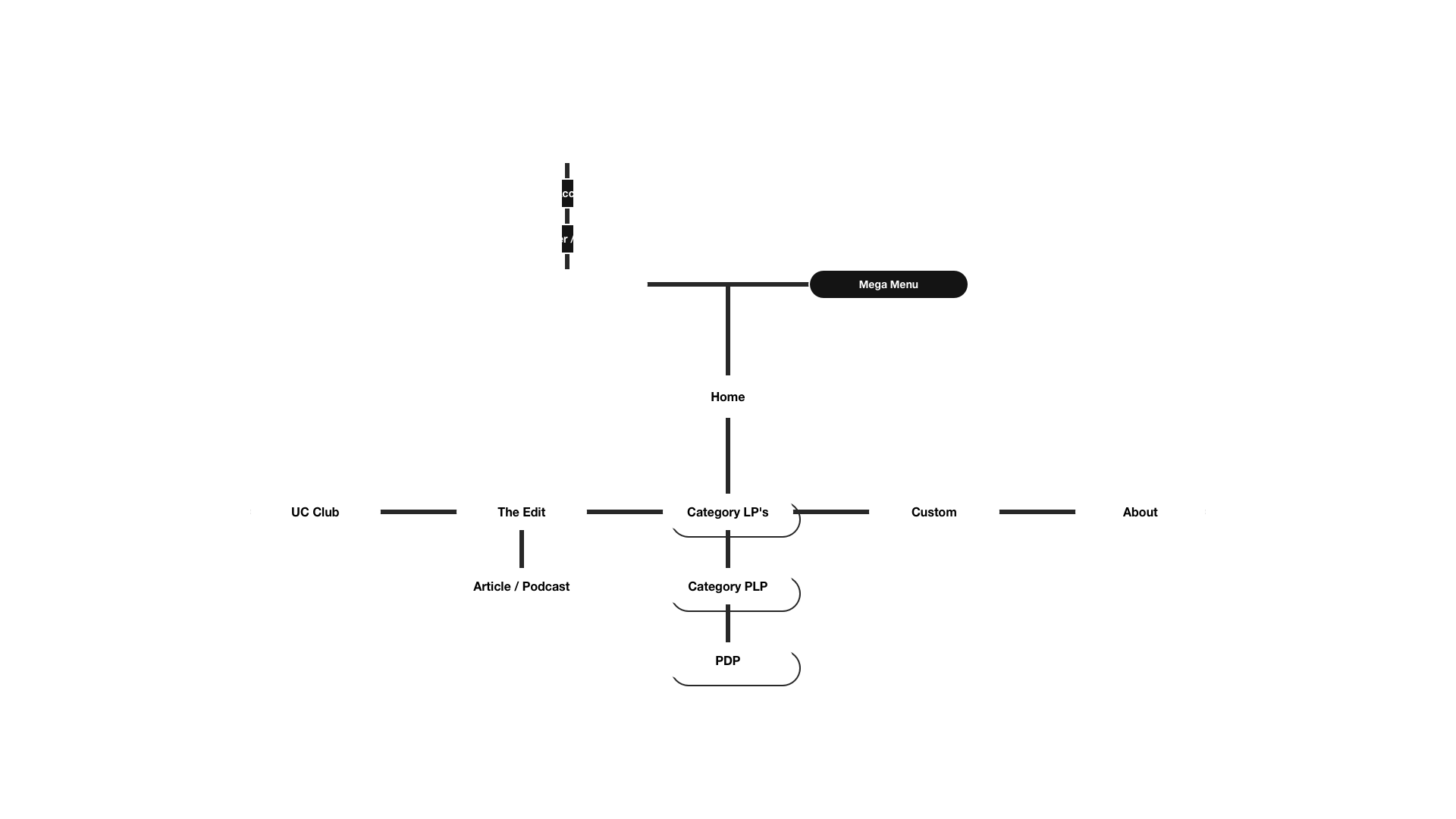
I started with a bit of house keeping before jumping in and designing some high def wires. The grid was established for Desktop and Mobile, then I mapped out a simple site architecture.

Home page
I created a simple page loader animation, then focused on designing an environment where someone can navigate through content. There's an editorial angle to the layout and flow of all pages, to really showcase the product.
Navigation
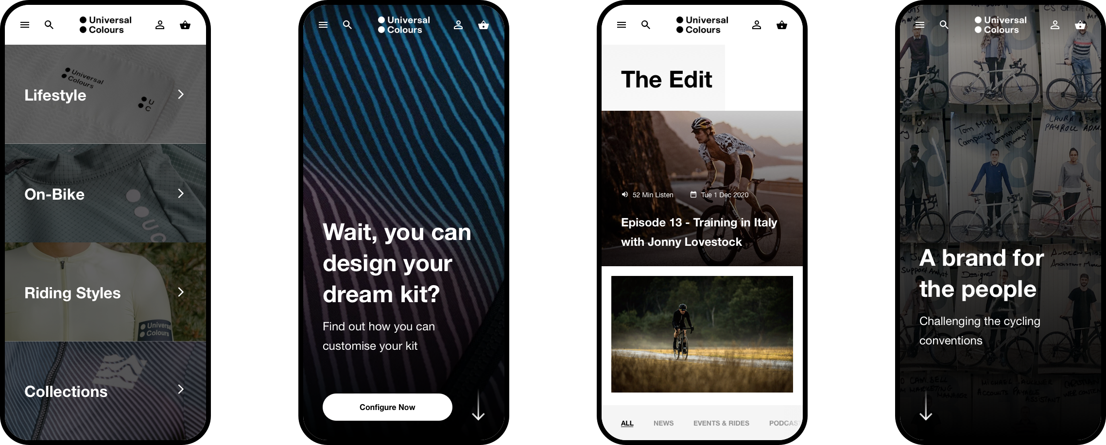
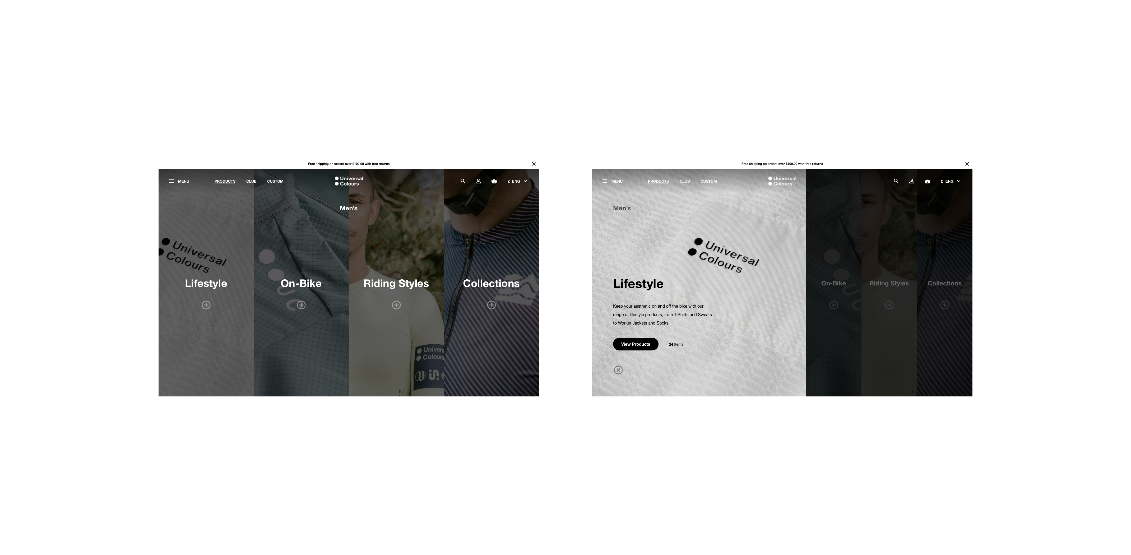
The header contains quick links for convenient access to specific areas, whilst the full-screen mega menu tucks away a slick and easy multi-tiered navigation.

Rider's Club
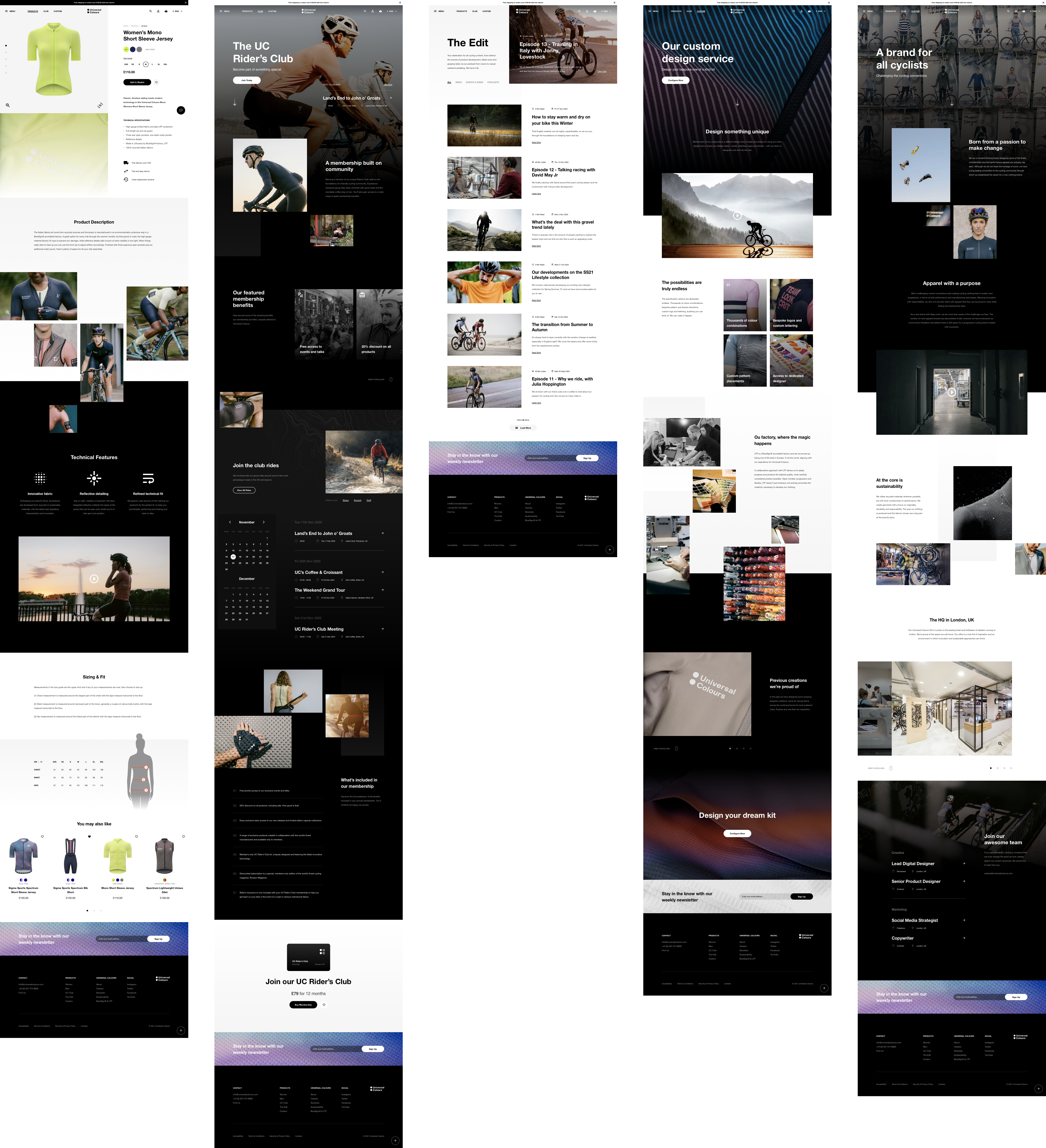
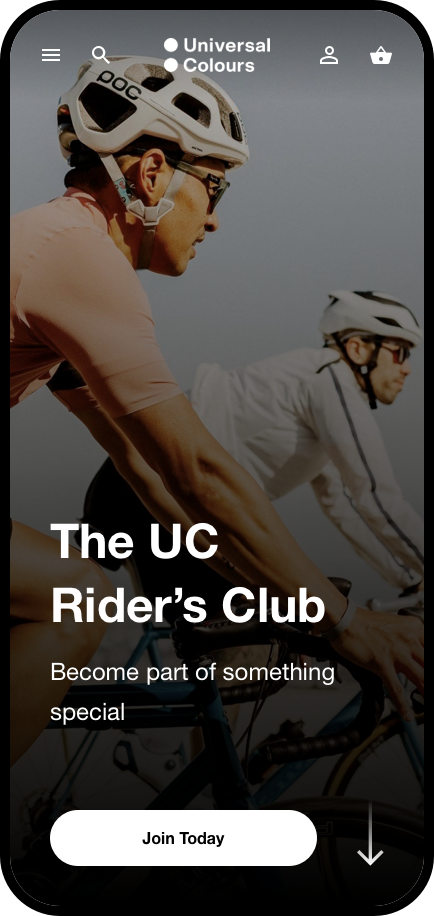
At the heart of cycling, is a community and I envisaged an annual rider's club membership which comes with a whole bunch of benefits for the modern rider. I wanted this page to be dynamic and contain some interesting components that elevate the experience.
And some more
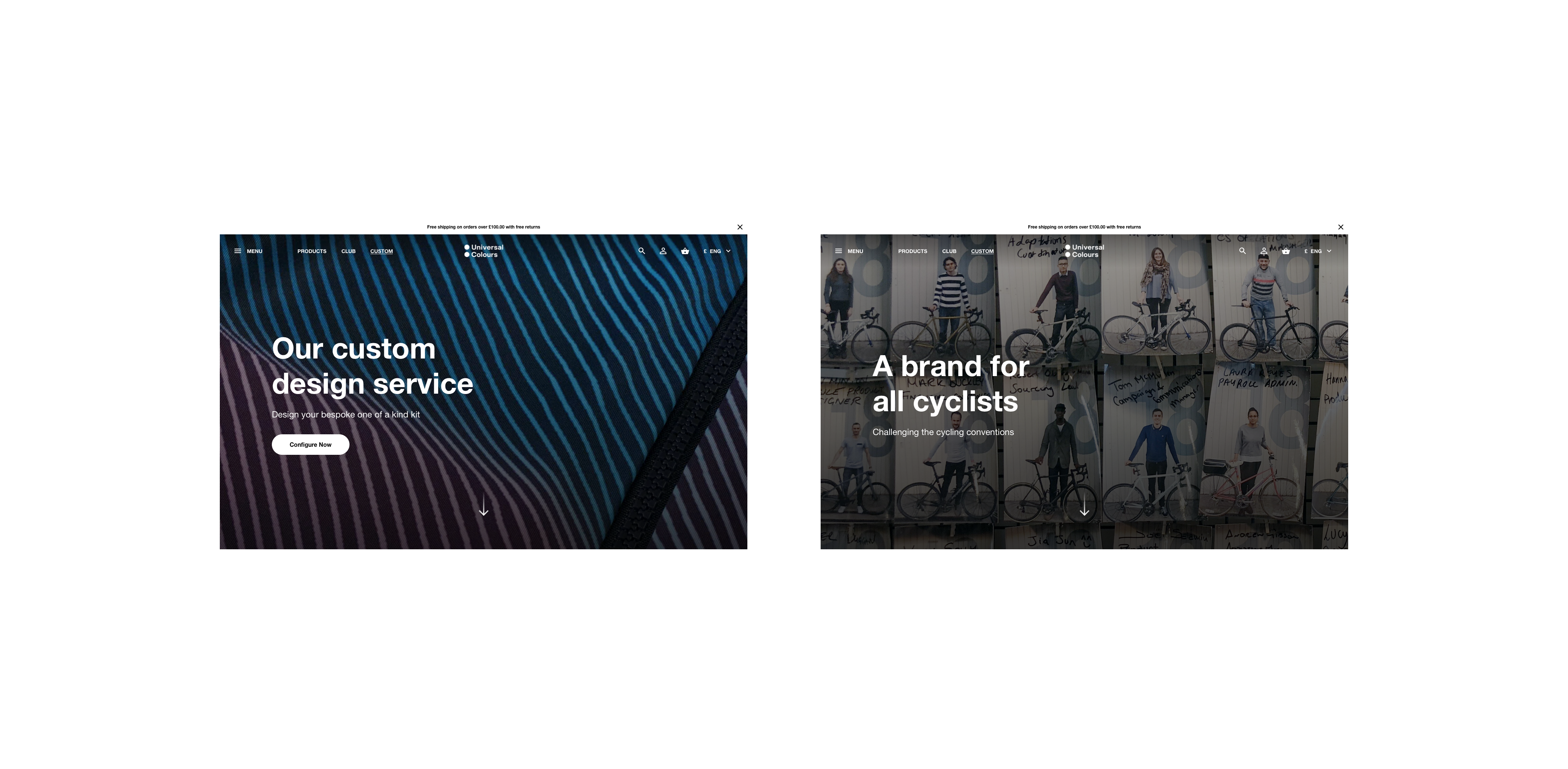
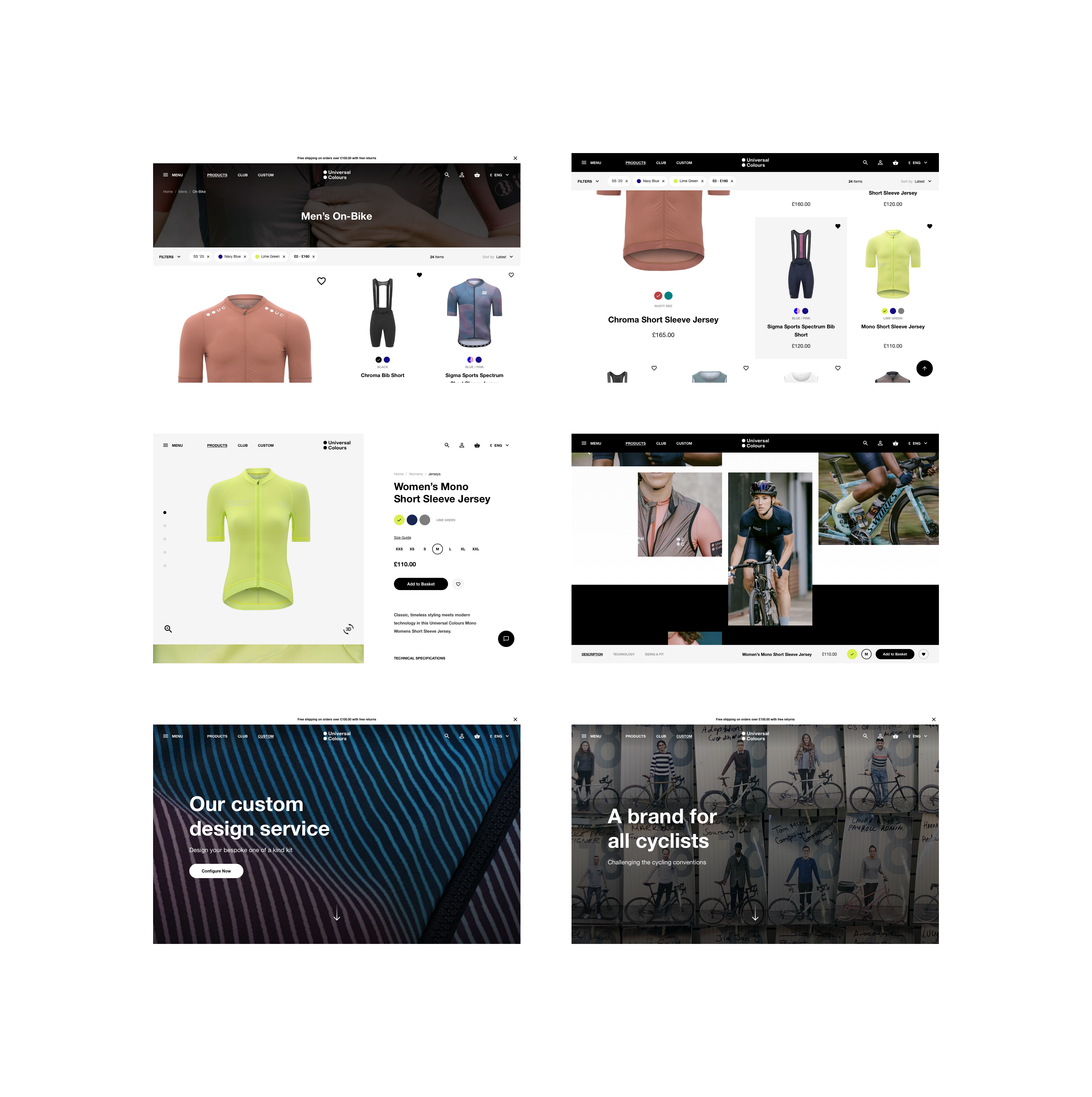
Below are some additional pages I designed, one being The Edit which is the editorial hub and the other being UC's customisation service, aimed at bespoke requirements cycling groups and teams may need.
